Travel Deals Refresh

Delivered a fresh modern UI to an existing experience

Case Study

Case Study

UX Design

UX Design

Travel Booking

Travel Booking

5-Min Read

Honeyfund.com offers crowdfunding as an alternative option for wedding gift registries. As part of an early phase of adding travel planning and booking into Honeyfund's experience, it was necessary to modernize the interface for their travel deals experience.

Honeyfund.com offers crowdfunding as an alternative option for wedding gift registries. As part of an early phase of adding travel planning and booking into Honeyfund's experience, it was necessary to modernize the interface for their travel deals experience.

Challenges:

Starting with an existing design, we sought to modernize the interface to make it more functional, as it would serve as a backbone for future travel booking experiences.

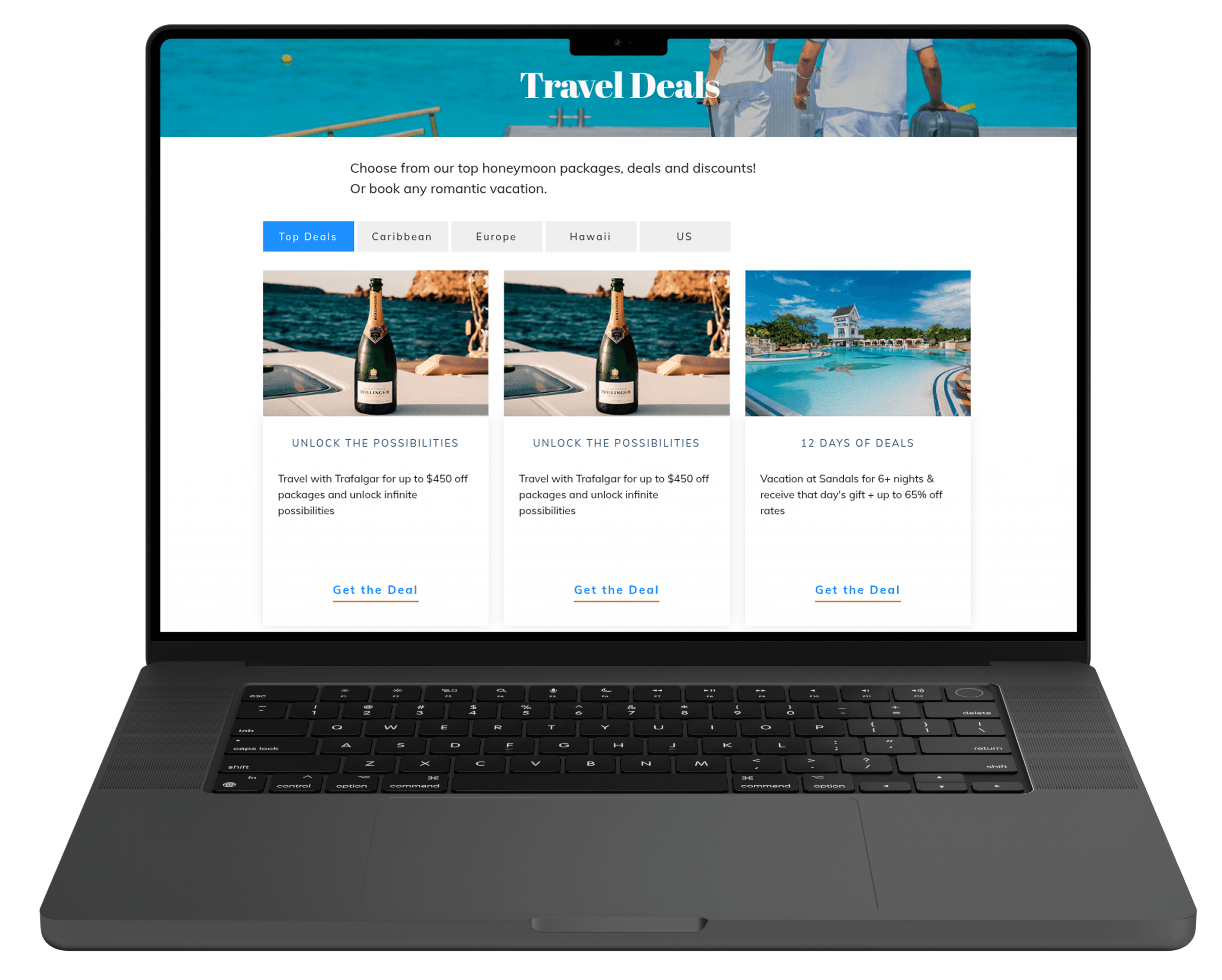
The existing experience only included a title, generic photo, and block of text for each deal type, making the deal cards difficult for users to scan.

The page had no search function, or any way to filter down results.

Many of the deals were generic and obviously ad-like, which could be easily identified by users and not seem like it would add much value for them.

Resources were limited. I was asked to provide high fidelity designs in a short time.

Process:

Before I was brought in, the team had performed some research and initial ideation.

User Journeys

Wireframes

Feature List

I augmented that by doing an exhaustive competitor analysis of dozens of travel booking websites. I compared what features and elements they had with the existing patterns and needs of their page.

I continued by providing designs for new UI elements including:

Search/filtering functionality

New iconography representing offer categories

New iconography representing
offer categories

Redesigned deal cards featuring more scan-able layout

Redesigned deal cards featuring
more scan-able layout

Outcome:

The final product was launched and resulted in a healthy up-tick in performance for the page. Additionally, it prepared the site for future travel-booking features that will significantly widen the company's revenue streams.

Additional work is being done to increase the value of the offers to users. As the deals are curated and fine-tuned to avoid offers that just sound like generic banner ads, users will have more incentive to spend time searching for offers that will enable them to upgrade their honeymoon experience.

We ran the pilot for over a year. The primary requirement of the pilot was to reach a completion rate greater than, or equal to the legacy (control) experience. We iterated on several different aspects of the interface, reducing the number of steps, and scaled back the features that encouraged users to add non-rx items, but ultimately the challenges I outlined above proved too much to overcome given the resources we were working with.

Evidence strongly pointed to load times on the cart page as the culprit leading to increased abandonment. Although we ultimately differed this add-on feature, it directly led to the following improvements in the overall ecommerce experience:

Improved the interface by making the deals more scan-able.

Traffic to the page increased 150.17% month/month.

Click through rate increased by 185.83% on the deal cards.

Two screens that appear to have the same content, but look very different.

Desktop rendering of live-site before redesign

Desktop rendering of live-site before redesign

Two screens that appear to have the same content, but look very different.

Desktop rendering of live-site after redesign

Desktop rendering of live-site after redesign

Three iphones showing a user interface for this featrure

Mobile rendering of live-site before and after redesign

Final product list page, cart page, and checkout page

© 2025 Brian Talbot

brian@briantalbot.design